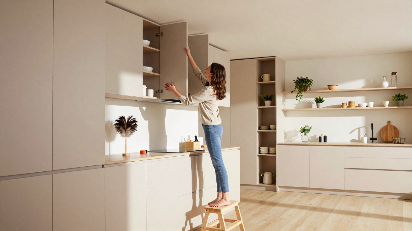
The first time I truly noticed my kitchen cabinets was not when I purchased them, but when I attempted to clean the upper units. Perched on an unsteady chair with a sponge in one hand and the handle gripped in the other, I peered into a dusty void where forgotten packets of pasta seemed to disappear. The cabinets stretched all the way to the ceiling, resembling a row of beige teeth. They had been meant to look “elegant” and “practical.” Instead, they felt…overwhelming.
That was when I had a subtle but uncomfortable realisation: this aesthetic was not really mine. It had been marketed to me.
All at once, those towering cupboards seemed like a trap I had bought into.
How Ikea sold us the wall-to-ceiling kitchen dream
Visit an Ikea showroom on a Saturday and it becomes obvious how the tall-kitchen idea takes hold. You follow the set route past cheerful families and immaculate islands, until you reach it: a bright white kitchen with cabinets rising neatly to the ceiling. There are no gaps, no dust and no apparently wasted space. The lighting is flawlessly warm, while the worktops are completely clear.
You do more than simply see it: you picture your future self living in it.
One Swedish-inspired room set after another delivers the same message: vertical storage means intelligent living. There is a “small apartment” display in which every centimetre has somehow been claimed. A 38-square-metre studio appears to fit a full-size fridge, an oven and an army of upper cabinets standing in military formation. A charming sign says “More life per square meter”, and your mind silently interprets it as “More cabinets equals more life.”
You take a photograph, send it to a friend and, before long, that stacked wall becomes your benchmark for what a “real” kitchen should look like.
Designers say this is no coincidence. Tall cabinets allow brands to fit more products into the same floor area, encourage you to add extra units and sell a vision of order and status. Our parents grew up with shorter cabinets and some breathing space above them. We grew up with marketing teams presenting that gap as a “problem to solve.”
As a result, we were taught to view empty space as failure and vertical clutter as sophistication. That’s the quiet psychology behind your full-height wall of doors.
Why designers now say those tall cabinets were a massive mistake
Ask an interior designer in private what they genuinely think about wall-to-ceiling kitchen cabinets, and many will sigh before answering. The concerns tend to be the same: they are visually weighty, impractically high and too domineering in smaller homes. The pristine showroom effect can quickly become a looming storage monolith in an ordinary flat with a low or standard-height ceiling.
Your kitchen no longer feels like somewhere to breathe; it begins to resemble a filing cabinet.
I spoke with a London-based designer who recently removed a ten-year-old Ikea kitchen from a narrow terraced house. Its previous owners had proudly fitted tall cabinets “for resale value.” The highest cupboards contained Christmas crockery, a broken blender and three glass sets they had forgotten they owned. Reaching any of it required a step stool and a steady frame of mind.
After the designer swapped those towers for one row of cabinets and a straightforward open shelf, the owners entered the room and said, “We had no idea this room was this big.”
The reasoning behind the design is straightforward: tall cabinets form a solid vertical mass that visually divides the room. Light no longer travels and bounces as freely. Corners seem gloomier. Rather than moving around the space, the eye meets a harsh stopping point at the cabinet fronts. This is why so many new, “expensive” kitchens online feature lower, horizontal lines and open space above them.
Designers are not arguing that storage is a bad thing. Their point is that making every wall a floor-to-ceiling cupboard can quietly damage a room’s scale, atmosphere and everyday sense of home.
What to do if your kitchen is already a tower of cabinets
You do not have to tear out your entire kitchen to escape the effect of a tall cabinet wall. Begin with a single area. Pick the most overbearing run of upper cabinets and picture it as something different: an open shelf, artwork or a patch of breathing room. With many Ikea-style kitchens, it is possible simply to take off two doors and remove the cabinet boxes behind them, then repair the wall.
You immediately restore a horizontal line to the space. It is like allowing the kitchen to breathe out.
If removing cabinets entirely feels daunting, make a “soft edit” instead. Empty the very top shelves and place their contents in one clearly labelled box somewhere else for a month. Pay attention to whether you ever need an item from it. If not, the cabinet is adding visual bulk for no purpose.
We have all experienced that moment of discovering that half the kitchen is really a museum of spare items we forgot were there. Honestly, no one climbs a ladder twice a week to carefully rotate their fancy glassware.
One interior architect I spoke to expressed it plainly:
“Upper cabinets are like overstuffed inboxes. The more you have, the more clutter you feel allowed to keep.”
She suggests three straightforward, low-risk options:
- Remove or shorten one run of upper cabinets to introduce a visual “break”.
- Swap a few doors for glass fronts or open shelves to create a lighter rhythm.
- Paint the remaining upper cabinets to match the wall colour and soften the block effect.
None of these options calls for a complete renovation; they are simply small acts of rebellion against the vertical wall we were taught to admire.
Rethinking what a “good” kitchen looks like now
Once you step away from the Ikea showroom fantasy, something unusual happens: your actual kitchen begins to answer back. It reminds you where you really stand while cooking, what you can reach without straining and where daylight naturally lands at 5 p.m. It asks whether you would rather live inside a storage unit or in a room where people genuinely want to stay.
The designers challenging tall cabinets are not trying to make anyone regret previous decisions. They are proposing a different question: what if “enough” storage is already enough?
Some homeowners are retaining generous lower cabinets and islands, while halving the upper units or removing them completely from one wall. Others opt for one tall pantry “column” and keep the rest of the kitchen visually peaceful. This is not minimalism as a form of punishment. It is about modern homes reclaiming softness, horizontal lines and the quiet boundary where the wall meets the ceiling.
Once you recognise how these huge towers reshaped our sense of what a “finished” kitchen should be, it is difficult not to notice it everywhere. The blank area above a modest cabinet begins to feel less like wasted space and more like a luxury: emptiness you did not need to fill merely because a catalogue told you to.
| Key point | Detail | Value for the reader |
|---|---|---|
| How Ikea shaped the tall cabinet norm | Showroom layouts and slogans made vertical storage a symbol of status | Helps you understand that your kitchen choices were influenced rather than inevitable |
| Why designers now push against ceiling-high walls | They make rooms appear smaller, hold unused belongings and reduce light and rhythm | Gives you a clear reason to reconsider or alter existing layouts |
| Small, achievable fixes | Remove one section, lighten cabinet fronts or move rarely used belongings elsewhere | Provides practical, affordable ways to reclaim space and calm |
















Comments
No comments yet. Be the first to comment!
Leave a Comment